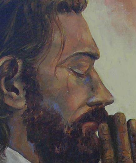
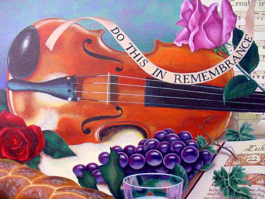
The shortest verse in the Bible, ‘Jesus Wept’ speaks volumes.
In Inspired by Faith, author Robin Landa address the why to creating artworks of faith. “Artists choose to paint religious and spiritual works in order to reveal their beliefs to themselves, to others, and to God…Painting, one of the most dynamic and complex mediums we have ever invented, allows us to seach out our minds and souls, revealing our inner worlds. Art makes ideas, feelings, and beliefs visible to ourselves, as we create it, and to others, when they see the finished work. Art affects its viewers, influencing people, awakening their perceptions, stimulating their senses and enlightening their minds and souls.”
My painting teacher who taught me much about color theory often talked about an artist having “soul” in their work. Although I was not a color theorist, nor my works impressionistic as his were, I admired much about his work, and sought to emulate his use of color. I tried to incorporate the color knowledge he taught me within my own style of painting. He told me that my work had a lot of “soul.” It’s not something I can thoroughly explain but what an artist believes comes out, indescribly, through their work.
We have reasons for creating. Something moves us. If we experience much in our hearts as a result of our faith, then we somehow want to express this visually so that others might share our experience. We want to make our faith come alive for other people. As I painted Jesus Coming Forth From the Grave during an Easter worship service, someone in the congregation remarked to the person sitting beside them, “I’ve always known about Jesus, but when I saw this painting I realized He is alive!” This brought tremendous meaning to me and made all the long hours of learning to paint worthwhile.
Especially in times of widespread difficulty it is often artists that capture images that express what many feel. Such days are with us now. We search for comfort and meaning in the aftermath of horrible violence. Artists of faith paint, photographers of faith take pictures, musicians of faith play new music and writers of faith compose sensitive compositions to light the candle of belief and trust in God and give others a way to share their hope.
In these days may you use your God-given talent to encourage someone with faith.
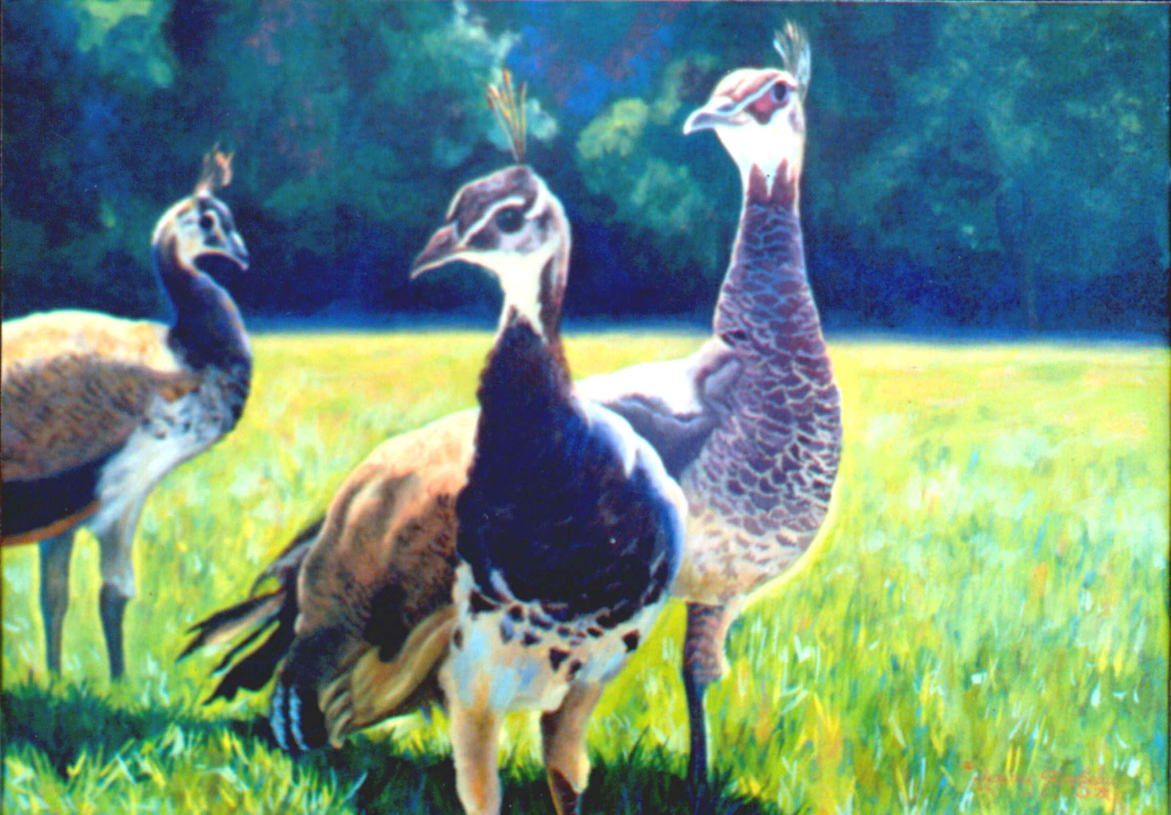
This sunlit painting of ‘Peahens’ also comes with a memory of it being stolen from a local showing.
Drawing is the basic componet of any artwork. Like piano playing to a musician, a knowledge and growing skill of drawing gives a good foundation and raises the maturity level of our artwork. A few components to consider as we pursue drawing:
Draw everyday! We artists tend to think that inspiration has to hit us before we start to create. Nonsense! That approach will make the creation of art sporatic and will elongate the learning process unnecessarily. If at all possible, try to draw, even a little bit, everyday. An athelete practices, a musician practices, a writer writes and an artist draws (or paints or sculpts, etc.). If we want to take our skill level up it becomes something we habitually do and we work it into our rhythm of life – on purpose.
Use the whole sheet of paper. Start to think overall composition and how to make each area of the paper or canvas attractive.
Really observe shadow and light. Make sure there is enough contrast. Squint your eyes to see the polarization of black verses white. If you can’t differientate your sketch when you are squinting then there is more contrast work to be done.
Make special note of the outline of your subject. Again, observe intently the shape of the lines and imitate what you see. Would your drawing be interesting if it was only the outside lines? Are the shapes attractive?
Look at the negative space. The areas around your subject – are the outlines and negative shapes interesting?
Consider texture. Is the texture of the subject you are replicating convincing? Need more observation and practice? Remember to draw what you really see (not what you ‘think’ you see.) Don’t make assumptions about the texture of a familiar object. Try to observe it as for the first time.
Enjoy what you do. Be encouraged with progress! Keep older drawings for a sense of history to see how far you have come. And don’t forget to sign and date your drawings for the same reason. You have a unique way of viewing the world – so sign that paper or canvas!
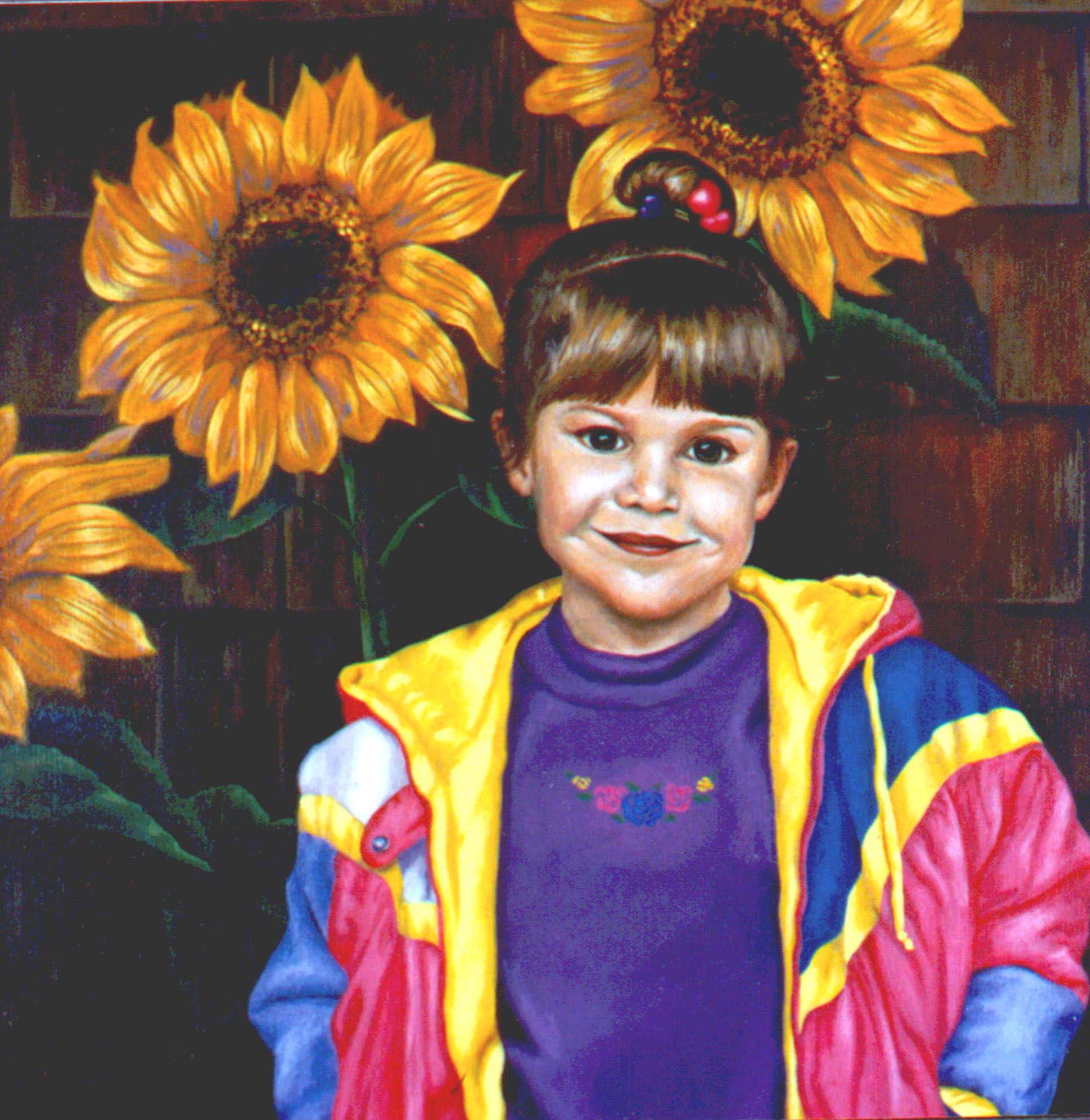
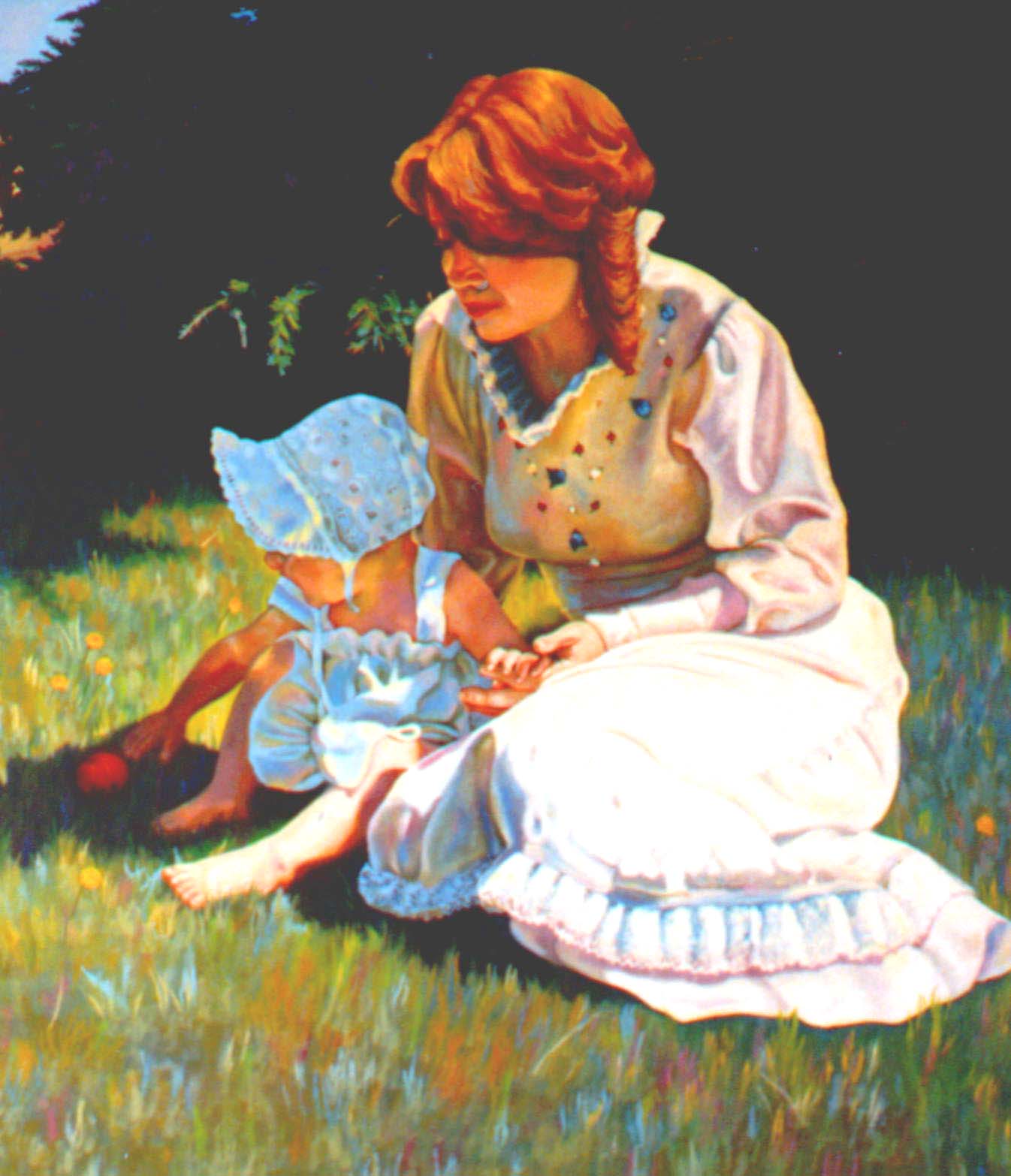
First day of school for my darling daughter. A judge, in a critique said that it was obvious that the artist loved this child. And the judge was right.
Shadows are interesting. Before the Impressionists came along with their love of painting outdoors, the studio painters tended to paint shadows as darker shades of the prevailing local color. With observation we can see that there is not only color in light but color in shadows. Unless something is completely dark there is some color going on. In creating the color for shadows we can accentuate what we already know to be there. So instead of thinking grayed browns and blacks, think dark green, blue, purple, perhaps even red – using them side by side in the same intensity (the same on the black and white scale). A great way to develop the skill of matching intensity is to photograph a finished colored painting with black and white film. Red, for example, is a very dark color, but because it is also bright, it fools us into thinking it is actually lighter. Children love to experiment with mixing color. It is just as fun as an adult. Enjoy!
We learn the color wheel as children. The most basic version of the wheel has the primary colors of red, yellow and blue and the secondary colors of orange, green and purple. We look at that wheel to see how secondary colors are mixed from the primary and to see the complimentary (opposite) colors.
To learn to mix color effectively we break down any color we see into these six colors. In this way we understand the composition of each color and how to use it in our artwork. For example, instead of saying “brown” we observe that the most dominant color in brown is orange and to make brown we would mix blue in with the orange. So instead of saying “brown” we say orange-blue (or as Jim Faber used to say “orangish-blueish.” It tells us how to mix the color. With much experimentation we learn how to compose color. With time we begin to recognize exactly how much of what color needs to be used.
It is absolutely necessary to have pure pigments or our color mixing will end up with muddy or grayed colors. While these colors are useful we won’t understand how they were made and how to mix the exact color we are trying to attain. In the “Introduction to Acrylics” post I explain the paint colors I use from Liquitex. No, I was not asked to do a commercial for this brand. I have just had such great success with it, that I prefer to use it because it’s colors are so pure. I’m sure there are many other fine brands.
Complimentary colors (the opposite on the color wheel) cause the juxtaposition of the two to create a real visual spark. Opposite colors sing when seen next to each other. This is something Vincent Van Gogh understood in a magnificent way. I have been told to see his later paintings in person in a museum setting almost hurts the eyes because the colors are so vibrant. “It pops” as we artists would say.
Speaking of Van Gogh, to grow in one’s knowledge of color, pick out a favorite artist’s work and really study what you see. Remember to really look at the color – not just what you “think you see.”
A key in learning to paint color vibrantly is observation. When we are young we learn that the sun is yellow, tree trunks are brown, the leaves are green and the sky is blue. After we learn this elementary approach to color we tend to stop looking. We really don’t observe in large part how light affects everything. The local color of that tree trunk may be brown (we will term colors differently in the future, but for now I’ll say “brown”), but take a closer look. Look at the side the light hits. Now I’m going to say one of those “Jimisms.” Don’t say what you think you see, but what you really see.” In other words, really observe what you see and throw out your default that says that tree trunk is brown. Look. Chances are where that sunlight hits the trunk there is sections that are yellowish, orangish…maybe even some pink. I know, you are thinking I’m crazy by now, but really look. Stare at it. And check out those shadows. Not just dark brown. You may see cool shades of blue, purple, green – yes maybe muted blue, purple or green but nonetheless colors that would be best described by those terms!
It takes awhile and concerted effort in observing to start to see the vibrancy of colors all around. And yes, at first I thought my teacher was a little loony at first until it clicked one day and I too, started to really observe color in objects. Many an artist has described this as “scales falling off the eyes.” All of a sudden what was not seen is in clear view.
Observing – it is a key to much as we learn to paint pictures of the world around us with realism and vibrancy.
And that reference to ‘scales falling off the eyes,” – that is a direct quote from the Apostle Paul’s life – when he was blinded by the light as he encountered the risen Christ, and then was healed and given his eye sight back. Powerful stuff.
I grew up with the term “artist” attached. My parents were the most encouraging parents in their support of my artistic endeavors that I could imagine. And so I am very blessed. My mother did (and still does at age 88
My baby daughter and I provided the models for this painting.
) paint portraits and my father was an extraordinary craftsman. I attended good schools with strong art programs and drew everyday of my life for over thirty years. My husband and I owned and operated a successful stained glass studio for seven years in Southern California.
All that to say that when I had been painting seriously after a few years I came upon some teaching on color that made me realize that I had missed a significant part of an art education. I thought at first – what’s to know about color? Blue and yellow make green. I understood contrast and could put together a strong black and white composition. Color, so I thought, was just kind of like colorizing a black and white photo, in effect. Shadows were just a darker version of the local color. Right? Not right.
One evening in the small Northern California town to which we had moved to escape the pressured city life, we walked into a small business that was holding an opening for a local artist. His work was stunning. It was more impressionistic than mine. Even though I admired it I was very comfortable with my tighter style of realism. It wasn’t that aspect that caught my eye. In fact, I wasn’t sure what caught my eye. I just knew that he possessed, artistically, something I didn’t have. There was a maturity and vibrance about his work that was a bit mysterious to me. I wanted that “something” in his work that I did not have, and so I met the artist and asked for lessons. He enthusiastically invited me to a new class he was starting at the community college. There began color lessons under the tutelage of Jim Faber.
It didn’t take me long to hear what that “something” was that my work was missing. It was a knowledge and application of color. Thinking that the color wheel was kind of like learning one’s abc’s, I could not have been more mistaken.
Jim started by explaining to us that the world was filled with color and light. And that light has an effect on everything. Even in shadow there is marvelous color. In addition he explained that in light there is all colors (think of a prism) and so that what we know to be true about color (even if we don’t totally see it) we can apply to our paintings. Therefore nothing on our canvas should be a section of one plain color. In everything there is all kinds of colors jumping around. That was a revelation. And that was the beginning.
Close up details of the beauty of natural and simple subjects.
What is Arylic?
“The dictionary tells us it is a glassy thermoplastic made by polymerizing methacrylic acid and is used in castings, moldings, coatings and adhesives. But as a painting medium, acrylic can best be defined as versatile.
An acrylic painting can resemble anything from a watercolor to an oil, though the techniques used in applying this medium are its own. With a great variety of brushes, as well as a palette knife, sponge, tissue paper or even your fingers, you can apply acrylic in any consistency ranging from thin washes to virtually sculpted impasto. It is workable on paper as well as fabric and wood. Acrylic can be used with a whole spectrum of techniques from glazing to crosshatching, including scrubbing, sanding, spraying, bubbling, collaging. There are acrylic paintings in every style and genre, created in the studio or on location outdoors. To top off the list of acrylic’s attributes, it is extremely durable and colorfast when finished, and it is correctable by a variety of methods at any stage”.
-Earl Grenville Kileen, The North Light Book of Acrylic Painting Techniques.
Liquitex Paints (my favorite – a little commercial – they are my favorite because they are true to color – limited palette). From the Liquitex Paint website: Liquitex.com
Liquitex is a professional range of products developed for the acrylic art specialist by the world leader and authority in acrylic innovation. Our colors and mediums have been developed as a comprehensive system for work on virtually all surfaces and with an unlimited range of specialty effects, from thick sculptural techniques to thin permanent watercolors or inks and everything in between. The range is renowned for its versatility and is exceptionally well suited for all applications, from traditional to experimental to cutting-edge contemporary. Our palette includes Medium and High Viscosity Professional Grade Paints, BASICS and BASICS MATT Student Colors, Specialty Paints, Surface Preparations, Additives, Mediums and Varnishes for artists.
Drying Time: The dry time for all water based artists acrylic media depends on how quickly the water can evaporate from the application. This is dependent on –
The thickness of the product. For example, fluid varnishes will dry much more quickly than thick gels.
The thickness of the application. For example, thin applications will dry much more quickly than thick applications.
Relative temperature and humidity of the environment. For example, applications on warm, dry days will dry much faster than on cold, damp days.
Absorbency of the substrate. For example, applications on absorbent surfaces will dry more quickly than on a hard, non-absorbent surface.
There is a difference between dry time and cure time. Dry time is when the surface feels dry to the touch. Cure time is when the acrylic film is fully stable, close to its maximum durability, water resistant and less vulnerable to attack by mild solvents. This usually takes at least three days for thin applications and may take much longer (up to two weeks or more) for thick applications such as with Liquitex Super Heavy Body Color . For paint applications other than blending, wait until the surface is touch-dry before applying more paint. Thick applications should be firm and no longer ‘springy,’ with no obviously wet portions remaining beneath. Dry time can be accelerated by using a hair dryer. For varnish application, paint must be cured before varnishing. For two coats of varnish, wait until the surface feels completely dry to the touch before applying a second coat. This means that there should be no feeling of dampness to the hand when placed on the surface. Dry time can be accelerated by using a hair dryer. A good rule of thumb is to wait at least 12 hours between applications of varnish.
Colors:Color theory from my painting teacher, Jim Faber Limited palette:
Napithol Red Light
Cadmium Yellow Light
Hansa Yellow Light
Phthalocyanine Blue
Acra Magenta (used to be called Acra Violet)
Titanium White
Yellow Oxide (optional – convenience color)
Resources: Paint, brushes, canvases, artist materials
Locally (Humboldt County), I recommend Ellis Art and Engineering Supplies – owned by Darryl LaTorre. For online sources I have always used Dick Blick art materials (dickblick.com).
Favorite Books:
Heart of the Artist book (optional, recommended) by Rory Noland.
The North Book Light of Acrylic Painting Techniques by Earl Grenville Killeen (optional, for extra enrichment). Available through Amazon.com – new and used books. (published in 1995). Also available through abe.com (used books). I was a contributing artist.
The Bible (the book of books)
Other helpful items:
Easel
Water containter
Paper towels
Hair dryer
Spray bottle with glycerine
Palette (enamel trays are excellent)
Plastic wrap
Spray bottle – plain water
Good lighting
Reasons to Explore Creativity:
Have fun – creativity is a good and gracious gift from God.
Grow in appreciation for others unique gifts and talents
Glorify God – dedicate your giftedness to Him for His purposes.